
How Make Your Pastel Dreams a Realty
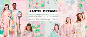
Our favorite trend this month is Dreamy Pastels! We're loving the dreamy, summer colors and whimsical patterns! It's easy to incorporate pastels into your next collection. Below are some tips to get you started!
A pastel color is defined as any hue with a high value (lightness) and low to medium saturation (the purity or intensity of the color). When we hear the word "pastel", soft pinks and blues immediately come to mind. However, soft neutrals and muted tones are a great entry point to pastels! This geo print from Kate Spade is a sophisticated take on an all pastel print.

Use pastels to convey optimism. Whether it's a bright note in an otherwise somber collection, or a totally exuberant statement, pastels are sure to give positive vibes. This poppy pastel print from Sportmax makes us want to jump for joy!

Don't be afraid to combine pastel colors! This palm print from Anthony Thomas Melillo looks fresh and new in pastels.

Pastel colors are traditionally associated with the spring and summer months, but don't be afraid to experiment! Soft snowy hues look great in winter hues, like this cool puffer by Perfect Moment.

However you use pastels, don't sleep on this big color trend!
Contact Plumager® for a gorgeous pastel print for your next collection!
 |
Danielle MacIndoe |
|
Plumager®, Inc. was founded by Parsons School of Design alumna Danielle MacIndoe. Danielle has worked with many top brands and companies in her career in print design. She hopes to expand Plumager®, Inc. into one of New York’s top print design studios. |


